Contábil Catete
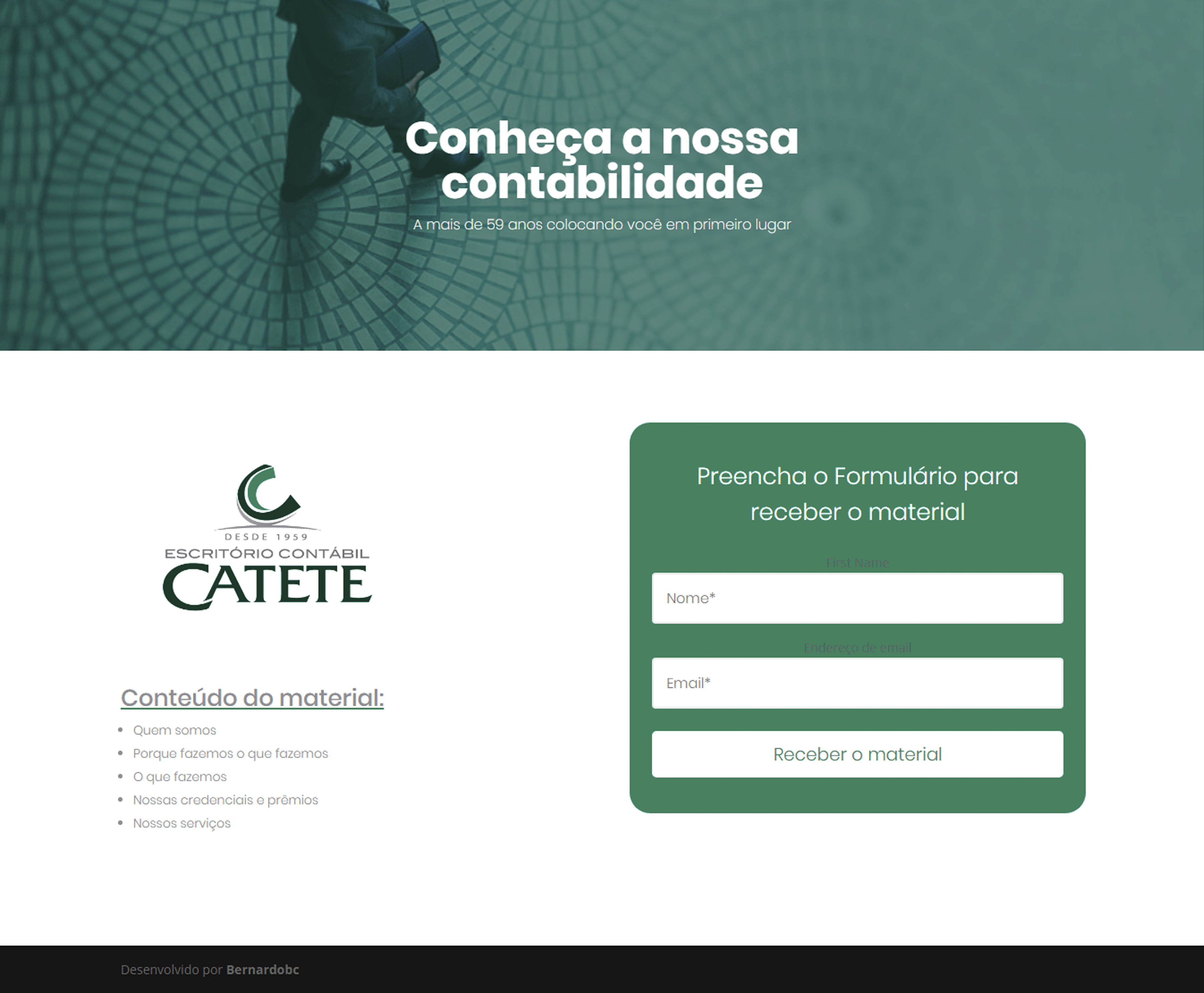
The website design of accounting firm Catete Contabil had as its starting point the customer’s need to update their virtual environment. As points of the briefing it was stressed that the site should be built in only one page, for the main content, and a support page for the dissemination of a pdf material, which would be sent by an email list. As for the aesthetic part, the requirements were to work the traditional, since the company has been stabilized for over 55 years, but with a modern and simple atmosphere, which could help to attract new customers and facilitate the usability of existing customers.
Challenge
The challenge in this project was to create a product that meets the customer’s wishes within an industry that normally has a very traditional and bureaucratic language.
Involvement
- Web Designer
Date
- November 2018
Type
- Professional
External reference
Involvement
- Web Designer
Date
- November 2018
Type
- Professional
External reference
Process
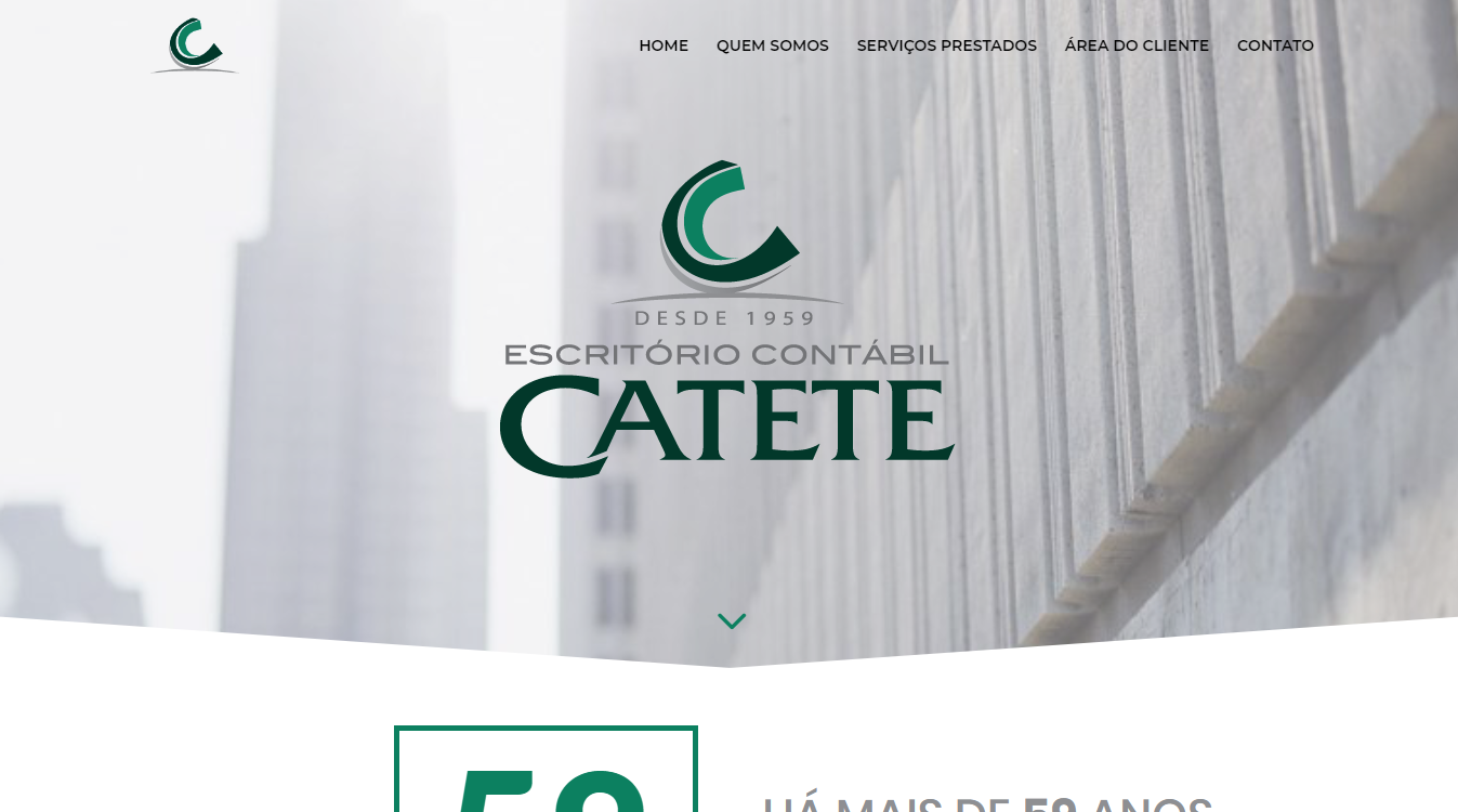
Using the methodology of Design Thinking, I started researching similar sites, competing sites and visual references compatible with the design parameters. Talking with the client about the material researched along with some sketches made, we have reached a desirable course. To create the atmosphere that united tradition with modernity, I chose to create a geometric header, which represents the area of activity of the company (mathematical, precise, direct), but which escapes from the conventional rectangular pattern of the html sections. The pentagonal shape suggests movement, flow and guide the user to move forward on the page.

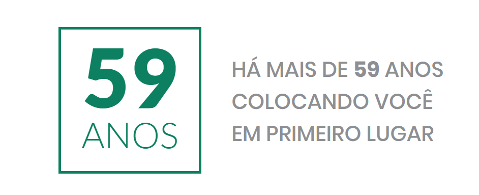
The weight and the animation in progressive counting give the necessary highlight the age of the company, demonstrating its tradition and modernity.
Lastly, I chose to merge the various services into cards and add a visual support element.
Final Result


