Guide It
Guide It was a project developed in the “Multimodal Interfaces” course of the Master of Multimedia at FEUP. In this project, me and 2 other members, had to design a new application that could meet unresolved demands or that could bring news and improvements to existing solutions. This conception would comprise the brief market study until the construction, in high fidelity, of the application screens.
Guide It was designed to serve the tourist public who spends a few days in one place. Thus, for the user to extract the maximum that the location can offer in a short period of time, the application generates a personalized guide according to its characteristics and interests.
Process
The project started with the determination of a theme of common interest and the defined theme was: Tourism. In addition to being a point of interest among the 3 members, tourism is a commercial sector that is on the rise in Portugal, soon becoming a potential market for new auxiliary services. After defining the theme and conducting research projects in the area, we found an opportunity to direct the focus of the application to tourists who spend, preferably, 2 to 4 days in one place. With this reduced time, the traveler will need to choose to visit certain places and miss other places. Our differential is part of this decision-making process, as the application aims to create a system where the user’s personal tastes feed the program and the user returns with a personalized guide.
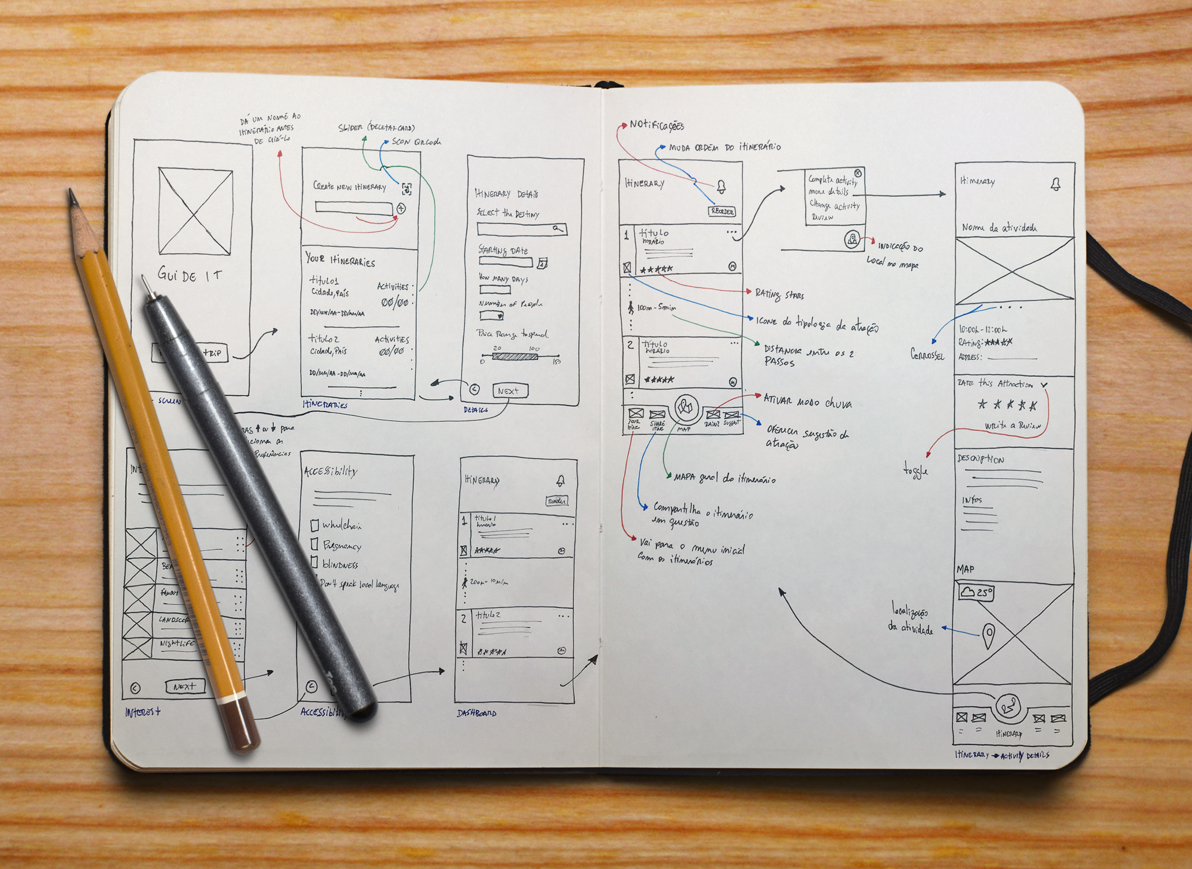
Once the central conception of the application, the audience and the market segment has been defined, we begin the first sketches of the application and its functionalities.
Involvement
- Experience Designer
- Interface Designer
Date
- December 2018 - January 2019
Type
- Academic
Involvement
- Experience Designer
- Interface Designer
Date
- December 2018 - January 2019
Type
- Academic

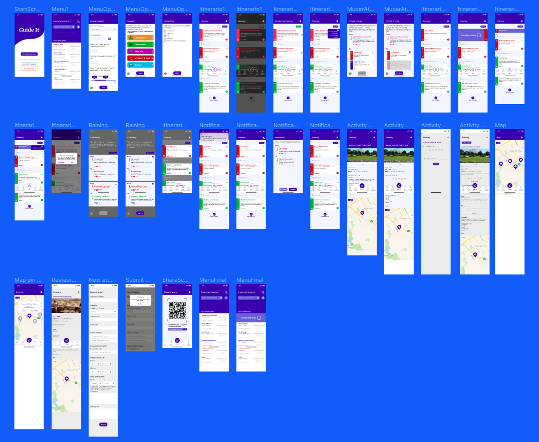
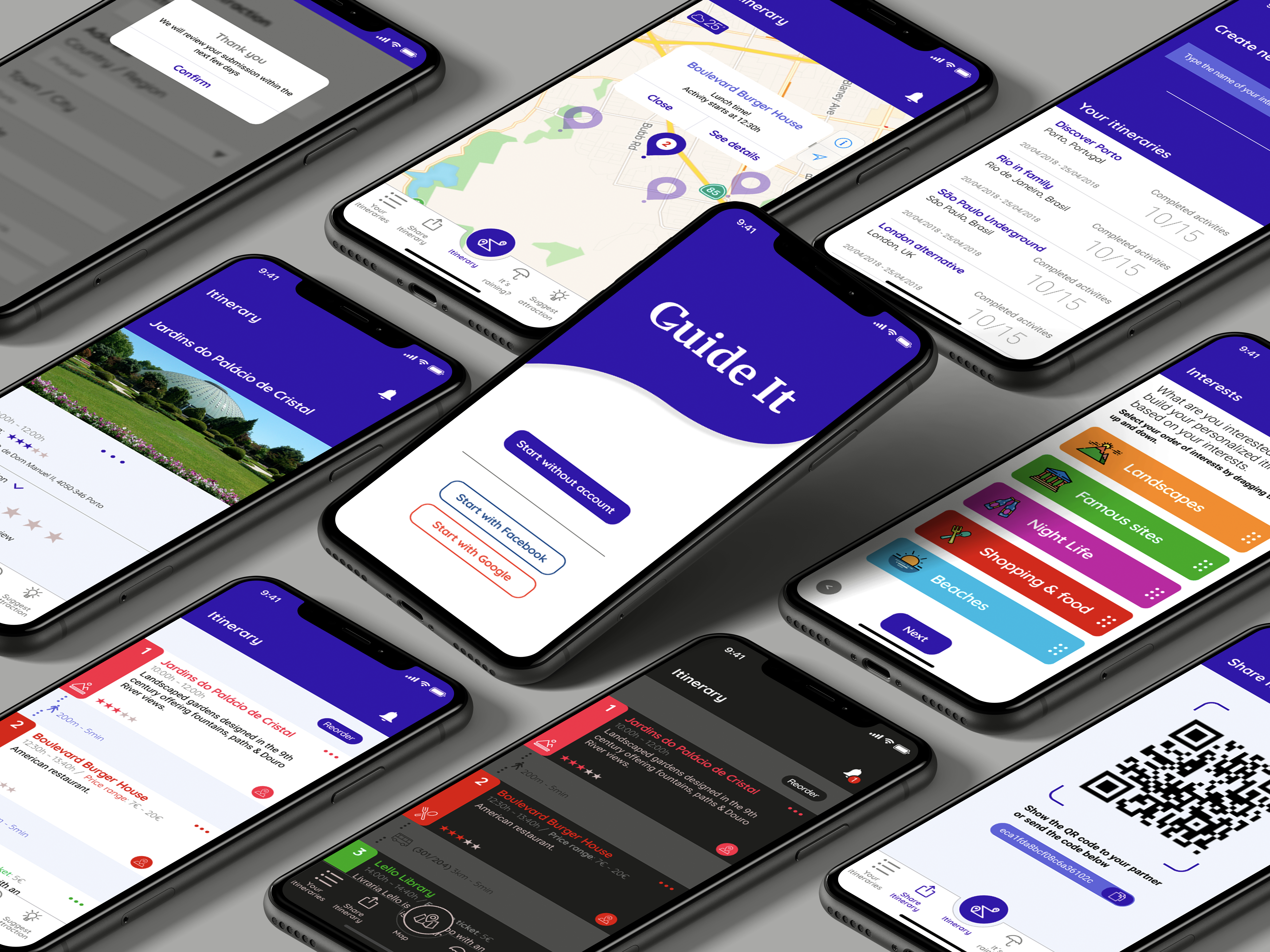
With the prototype in low fidelity, we performed usability tests with users relevant to the defined target audience. After conducting the tests, we started building the application at a higher fidelity, to test contrasts, colors, styles and validate what we collected from the first usability study.


