zzapp
The project
The company ZOS, which maintains the largest sports statistics site (www.zerozero.pt), has given us the challenge of creating an Android app for all sports fans. The purpose of the application was to allow you to search all broadcasts of sporting events that may interest you. Whether you are interested in a specific team or a particular sport, or are just looking for any game that might be interesting, the application would have all this information available in a simple and objective way.
The name zzapp, developed by the creative department, was based on the English word “zap” which, according to the Cambridge dictionary, means “to go somewhere or do something quickly”. The intention, using this English word, was to communicate that the user could view the sports channels, the various modalities that the application offered, quickly and simply. The “zzapp” spelling with two “zz” and two “pp” was a feature we used to combine the word “zap” with the zerozero.pt site and whether it is an application or, in short, an app. Thus, the brand not only conveyed the idea of “zap” but also marked that it was a zerozero app.
My contribution
Developed the concept and construction of the project name, as well as its visual identity. I also helped in the elaboration of the experience and user interface.
Logo
I started by sending some sketches to the client. Among these sketches were these first two examples, which stood out from each other. With this first contact I like to capture, from the client, the project profile he seeks. Something more traditional like a shield or something bolder and more modern like a very graphic rectangle
With the return on the first sketches, I sought drawings that were more reminiscent of the sporting world and, as in most, the ball is the protagonist instrument. So I decided to adopt the spherical shape as the base structure for the logo.
A second feedback provided by customers was regarding the colors of the first logo. We reached an agreement that defined that each color would communicate one of the sports modalities within the application. This stylistic gimmick would make the user experience easier to remember and less sober.
After feedback from the second step, I decided to correct some colors and finish with the “Z” in the center of the ball.
In the first example I tried to make 2 flags, forming a “Z” divided into two parts, which could communicate the “ZZ” zzapp or zerozero.
In the second example I just put a clean modern “Z” in the center
The final logo chosen was with the simple “Z”. So, I finished with the consonant typography.
Interfaces
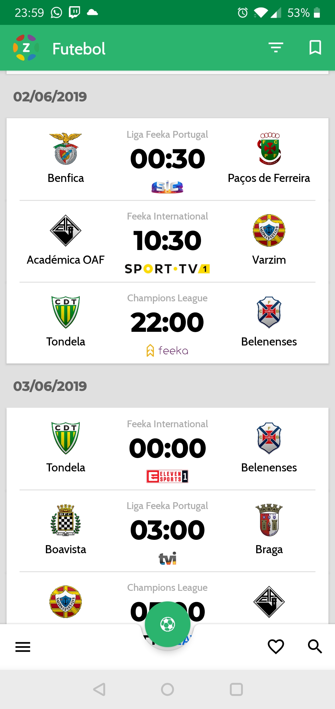
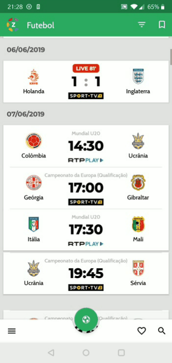
Home
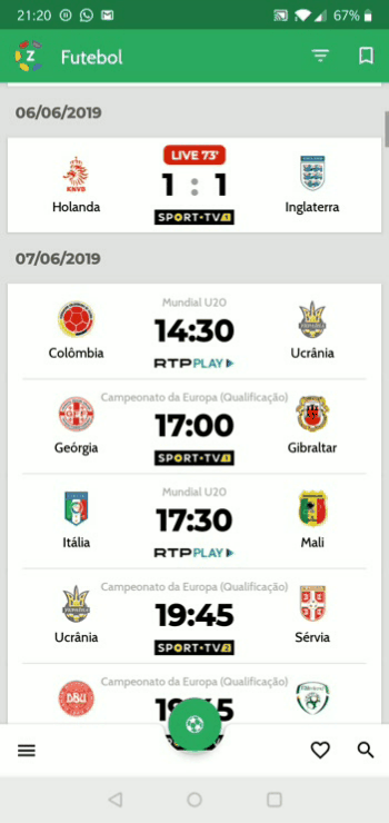
On the home page you can see all the games that are happening live, as well as filter by championships, teams, teams. In this screen it is also possible to quickly change the sport mode by simply clicking the center button with the shape of the ball and the color assigned to the sport.
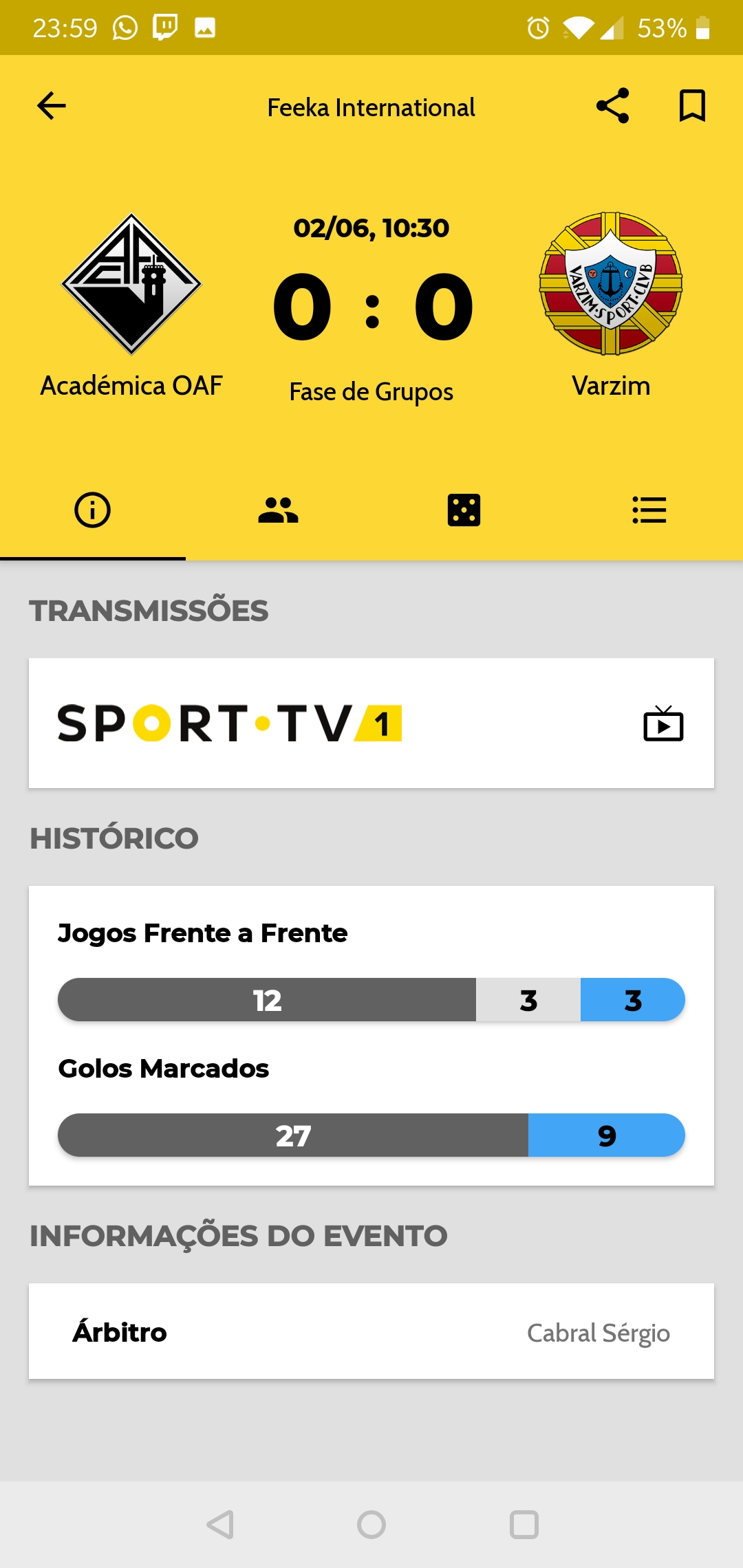
Game Page
On the game page you can see all information about the match in real time, know which channels are streaming and save favorite to receive notifications
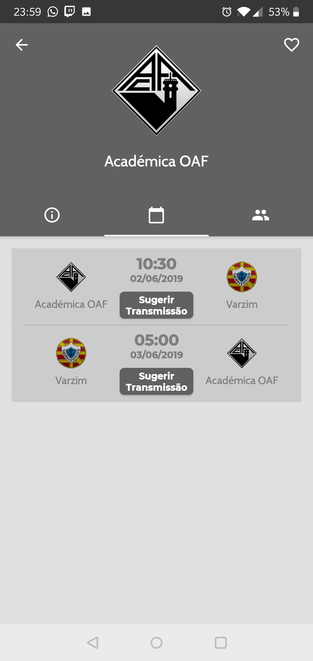
Team page
On the team page you can find out more about certain teams, follow the team so as not to lose any information and suggest a broadcast if that information is not present. The application has a collaborative character and encourages community participation by suggesting streaming channels that are not previously exposed.